The 3 crucial components to design a great first impression
Is your homepage failing to convert?
Are your website visitors bouncing in seconds?
Is your site not generating leads?
You need to make a better first impression.
Last week we talked about how people feel before they think (read it here). This week I want to focus on designing for that first impression… after all, we only get one.
How do you design a great first impression?
It seems like a complex question but I think the answer is pretty simple. To keep visitors from bouncing or to increase conversions, make the first impression captivating.
Yes, the goal of your homepage (or onboarding experience) is to be informative and move them to action. But you have to be careful to not go too far in the direction of efficiency.
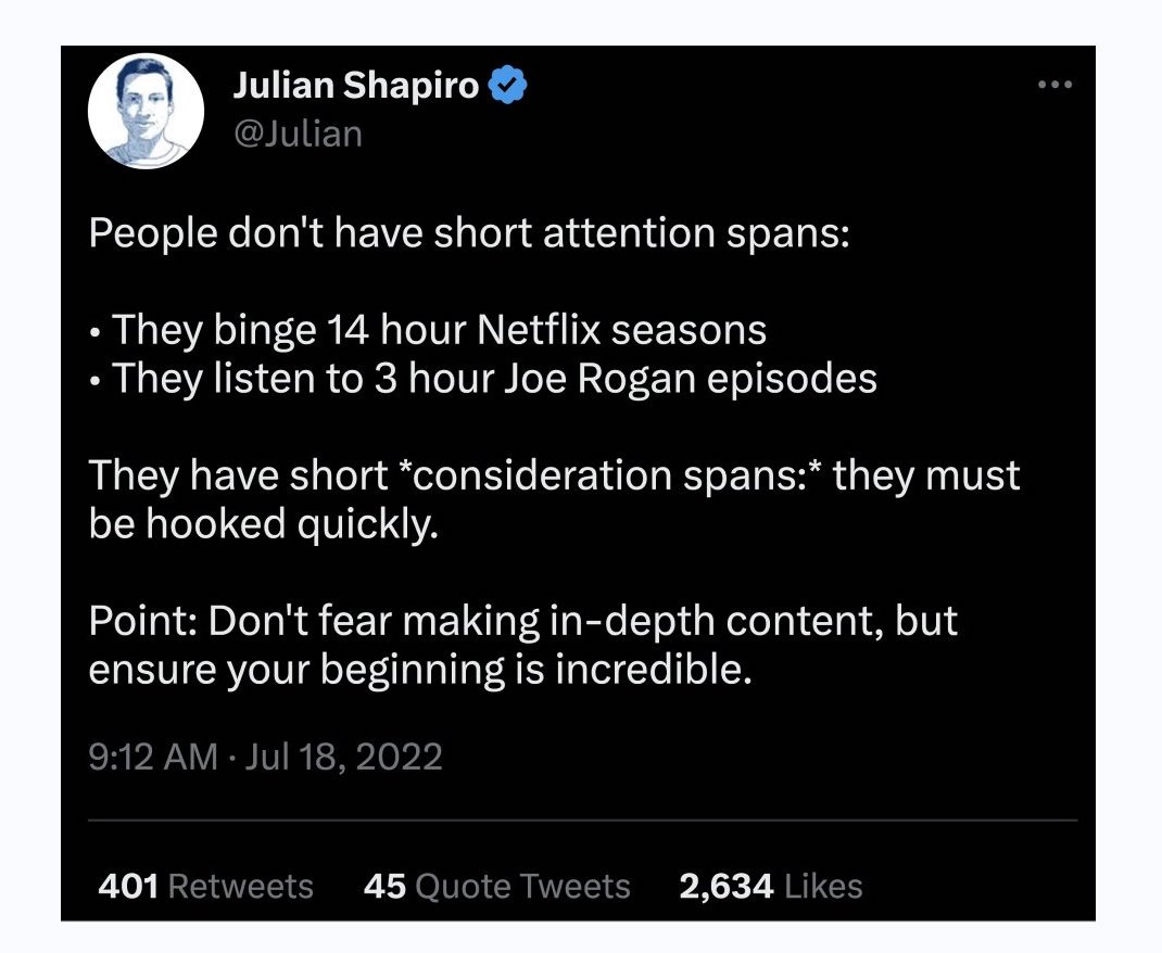
People have short consideration spans; the secret is to design an eye-catching hook.
What's your elevator pitch? Those aren't just for VCs. There’s a lot of emphasis with efficiency, get there in “as few clicks as possible, attention spans are on the decline."1 While efficiency and attention spans are important to design for, it’s people’s consideration spans we need to focus on when it comes to the first impression of our homepage.
Here are three ways to improve the design:
1. Go for a gut response
When we perceive something as “pretty” or “cool,” that assessment comes from the visceral level. Look, feel and sound dominate. Try using bold language and make a statement (that you can back up).
Design the website with attractive imagery, typography, and colors that evoke positive emotions. Use design elements to influence user behavior, such as highlighting the most important information to draw their eye.
2. Answer key questions at first glance
What do they really need to know? Don’t make users work to answer their key questions. Talk to your customers and potential customers to figure these out. Good high-level questions to start with are:
Who are we solving the problem for? — Make it clear who your product is ideally for. Be specific, products that try to market to everyone, market no one.
What problem are we solving? — Clearly address the problem you’re solving and make it relatable.
How are we solving the problem? — Use terminology and communicate things in a way that anyone who visits your site can understand. No jargon or acronyms!
What are their potential objections? — Proactively show how you address customer concerns.
What are your differentiators? —Use visuals to communicate and convey your differentiators - from product photography to visually appealing charts.
What’s the next step? — Have a clear, primary call to action.
Brainstorming activity: Set the timer for 10 minutes, and brainstorm every single question your customers and potential customers might have. Put an asterisk * next to the ones you’ve gotten the most. When organized, these questions will help form the flow of the information on your site.
3. Make it interactive
Too often sites fall into the trap of talking all about themselves. Think about a good conversation, it’s not one-sided. There’s back and forth. People respond positively to those who show genuine interest in them. Make your homepage interactive. Ask questions, test their knowledge, get creative with how you hook them.
Use surveys that tell the user something about themselves. Have a game that tests their knowledge and highlights your differentiator or market-value. If applicable, use a product configurator so users can customize and personalize the product to their liking.
Remember, the most important thing tho, is to be authentic. What worked for others typically won’t work for you. So don’t copy your competition’s site. Use it as inspiration, sure, but design an experience true to your brand. We’re all craving authentic interactions. Connect emotionally with your user. As Don Norman put it,
“Emotions are inseparable from and a necessary part of cognition. Everything we do, everything we think is tinged with emotions, much of it subconscious. In turn, our emotions change the way we think, and serve as constant guides to appropriate behavior, steering us away from bad, guiding us toward the good.”
Design, test and iterate. Push past the expected layer and dig deep into what your offering really is. Then make that your hook.
Things Worth Checking Out ✨
Highly recommend the book, How to Talk So Kids Will Listen & Listen So Kids Will Talk by Adele Faber and Elaine Mazlish, for anyone that wants to be a better communicator and improve relationships, not just with kids but adults too!
“The time for empathy is when someone wants you to know how they feel… It’s negative emotions that require our skill. That’s where we have to overcome the old temptation to ignore, deny, moralize, etc.”
Full of interesting relationship insights, watch Shannon Curry: Johnny Depp & Amber Heard Trial, Marriage, Dating & Love | Lex Fridman Podcast #366
AI Tool: Check out Taplio to “Grow your personal brand on LinkedIn (in 10min a day)” — I’ve been using the free trial and while I think it’s better for some industries than others, there are lots of things to love about it. Including a hook generator 👀
Thanks for reading! Please consider sharing this issue via LinkedIn, social media, or email. And give it a like! Your support means a lot 💛
Until next week,
raika
According to a 2015 study conducted by Microsoft, the average human attention span has decreased to 8 seconds (down from 12 seconds in 2000).


I just came across this video today and I think it captures pretty much all you wrote above. Nice post!
https://www.instagram.com/reel/Cqtax0fpLf1/?utm_source=ig_web_copy_link