Getting out of my creative funk
Hey there! I’m Raika, a Senior UX and Conversation Designer at Amazon. If you’re new here, welcome! You can subscribe to my Secrets to Great UX Design newsletter for weekly insights. I share actionable ways to create great experiences, grow your career and more… for designers and non-designers.
It’s been a few months since I last posted. Work is in a busy season and burnout feels like it’s slowly been consuming me. So I’ve been trying to change things up to get those creative juices flowing and overcome my writer’s block.
For me that has included a queue of YouTube videos, seeking renewal through epic conversations between Rick Rubin and Pharrell, and hearing Caroline Winkler’s ideas for making your home INSTANTLY stylish.
So a big thank you to Caroline and YouTube for showing me where two of my loves, flowers and sculpture, overlap.
→→ Ikebana
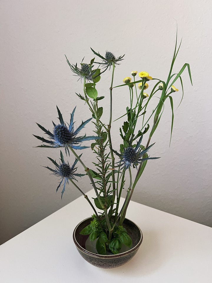
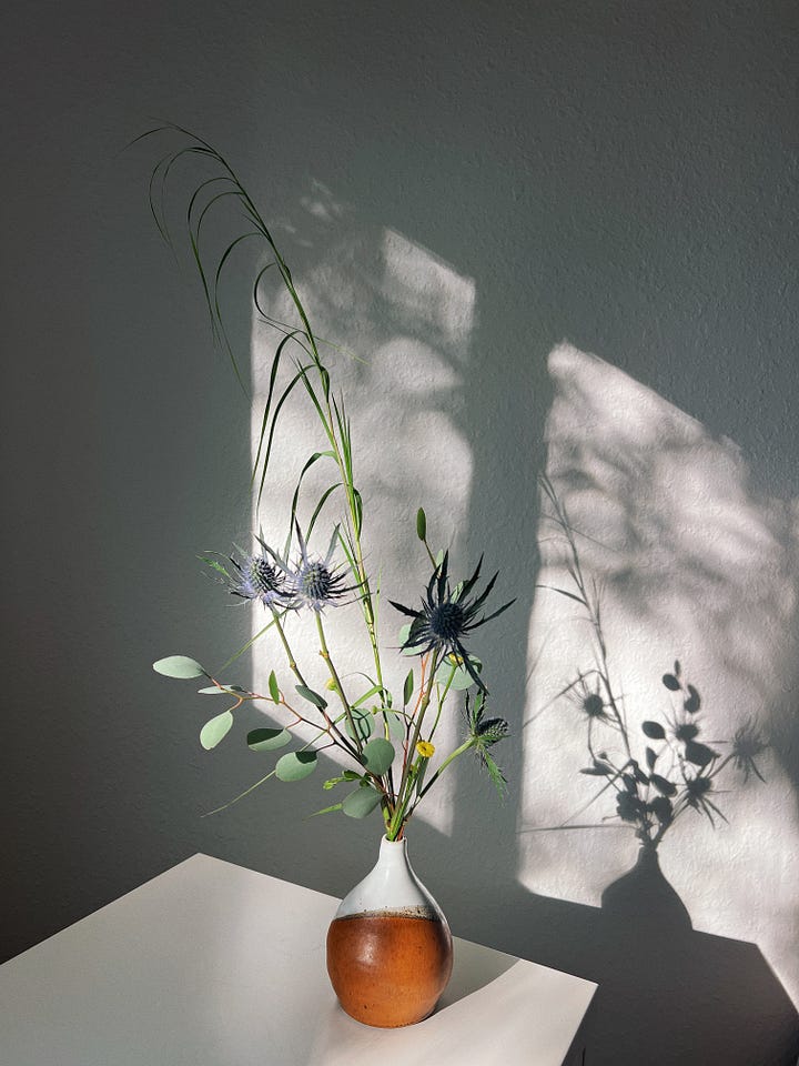
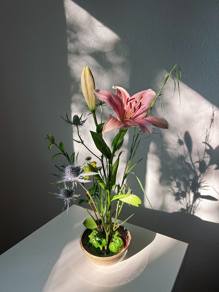
Ikebana, the art of Japanese flower arrangement, brings my love for flowers and sculpture together in the most lovely way.
And the more I learn about what makes a great arrangement, the more connections and parallels I see with what makes a great experience. Which makes me excited to design.
So diving in, what makes a great arrangement?
A great arrangement has clean lines, considers the use of space and aims to create harmony between the plants, container, and surrounding environment.
It’s created through simplicity, asymmetry, negative space, natural harmony and subtlety to ultimately create a composition that highlights the natural beauty of plants and reflect philosophical concepts.
Getting there is a process of adding and subtracting. A process of adaptation. And of course, experimentation.
Let’s dive a little deeper now into 5 of the principles.
1. Kanso | Simplicity
No big surprise here, simplicity is worshipped when it comes to design. And the Ikebana masters carefully select each element, considering its essential nature and contribution to the whole.
Similarly, in UX design, we strive for simplicity and clarity. A great UX designer when designing a new feature or interface is asking: "What is the core purpose?" Then, ruthlessly eliminates elements that don't serve that core purpose.
A streamlined design, like a minimalist Ikebana arrangement, allows users to focus on what truly matters. Less is more. Less is better.
2. Fukinsei | Asymmetry
While Western art often emphasizes symmetry, Ikebana embraces asymmetrical balance. Doing so creates a dynamic tension that draws the eye and evokes emotion.
Asymmetry in design can guide the user’s attention and create visual interest.
Consider using the Rule of Thirds in your layouts, experiment with off-center focal points to create a more engaging journey.
3. Ma | Negative Space
In Ikebana, the space between elements is just as crucial as the elements themselves. This concept, known as "Ma," creates breathing room and emphasizes the beauty of what's present.
White space isn't just “empty” space—it's a powerful design tool.
Great UX uses white space to improve readability, highlight important elements, and create a sense of calm in your interfaces.
What you leave out is as important as what you put in.
4. Shizen | Natural Harmony
The hardest of them all I think is mastering shizen, natural harmony. Shizen challenges artists to create arrangements that appear effortlessly natural yet are deeply thoughtful.
It’s about connecting the practitioner and viewer to nature, fostering mindfulness and respect for the environment while allowing for personal expression within the art form.
Finding that sweet spot between capturing the essence of nature and creating a sense of effortless beauty. Or in more UX terms, creating intuitive designs that feel natural to the user. Striving to align your interfaces with your users' mental models and real-world experiences.
Leverage familiar patterns and metaphors to create a sense of familiarity, even in your most innovative designs.
5. Yugen | Subtlety
I saved my favorite one for last. Yugen refers to a subtle, mysterious sense of beauty in the universe. It's about suggesting rather than stating, hinting at deeper truths through minimal expression, and appreciating the beauty in what's not fully revealed.
Not overwhelming with information.
Use progressive disclosure techniques to reveal complexity gradually for a great UX. Hint at additional features or content to encourage exploration without cluttering the initial experience.
Suggest more than you show, leave room for imagination.
Designers, embrace simplicity, use thoughtful aesthetics, and craft interfaces that suggest more than they explicitly show, inviting users to engage on a deeper, more emotional level.
As you approach your next UX challenge, consider these Ikebana-inspired questions:
Have I stripped away all non-essential elements?
Does my design create a sense of balanced asymmetry?
Am I using negative space effectively to highlight key elements?
Does the interface feel natural and intuitive to users?
Have I left room for user discovery and imagination?
Create designs that are not only functional but also deeply resonant and aesthetically pleasing.
Great design, like a masterful flower arrangement, is a delicate balance of presence and absence, complexity and simplicity.
With the lens of Ikebana, the practices of great UX are brought back to life and breath new life into my work.
I hope this framing does the same for you. 🌸
Ikebana Tips | Can You Tell What's Wrong? Nageire Tips for Beginners
Favorite Quote and Photos of the Week
“All that matters is that you are making something you love, to the best of your ability, here and now.” ― Rick Rubin


That’s it for today. Thanks for reading! Here’s to finding the reframe, skirting burnout and being true to ourselves 😊
Until next time,
raika


Ikebana is amazing, great share!